University District Food Bank
Spring 2022 • HCDE 508 (Visual Communication) • 10 weeks
#School #Design #Prototyping #Figma
Description
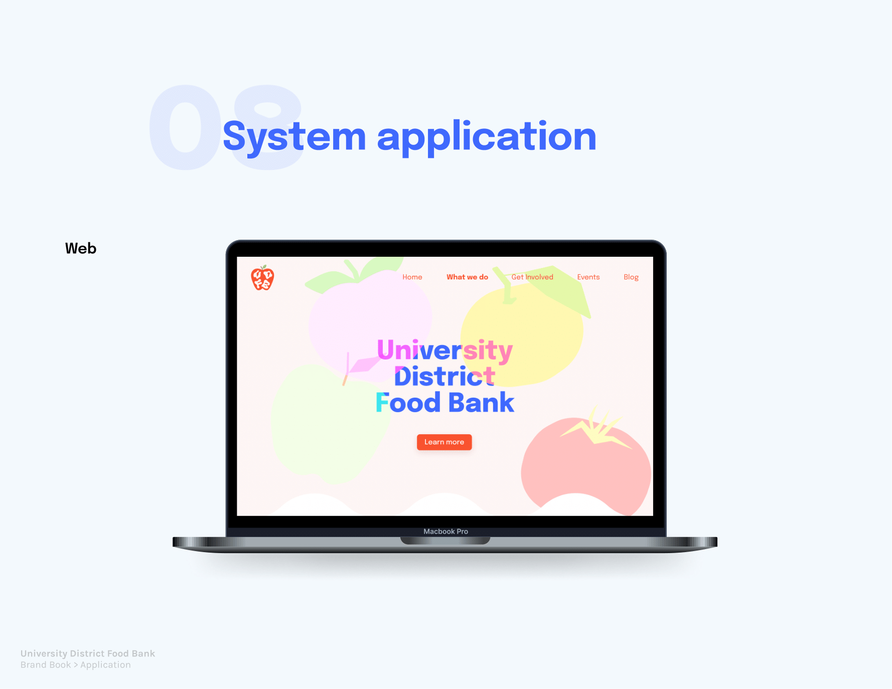
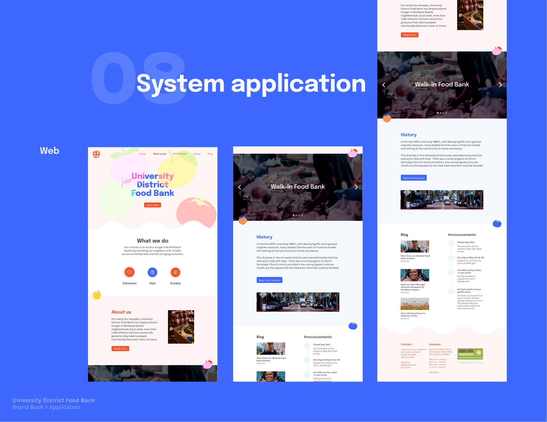
Through this studio course, I revisited fundamentals of visual design & composition and learned how to apply these principles when analyzing and improving an assigned brand identity. My "client" was the University District Food Bank, a food bank in Seattle that offers information on its mission and services on its website. I was tasked with redesigning its main webpage as well as exploring other venues of promotional design it could occupy, such as a mobile page and flyers or posters. This work was done primarily in Figma, and the course structure showed me the importance of regular studio critique and iterative feedback.
Responsibilities
▶ Research the UDFB website and philosophy to identify areas of improvement in design identity while maintaining the brand's core values
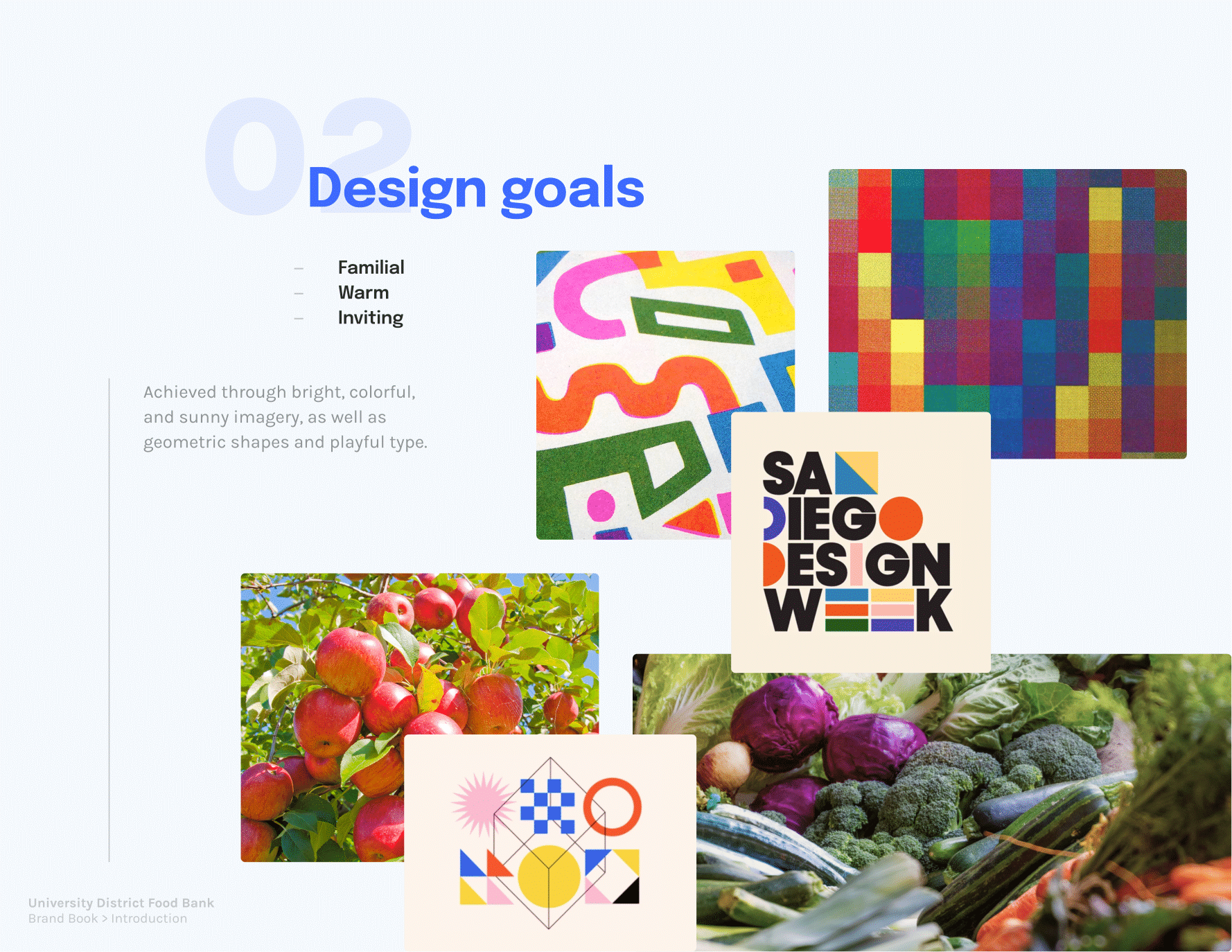
▶ Create a moodboard and iteratively redesign the main brand through visual principles like balance, scale, contrast, color, etc.
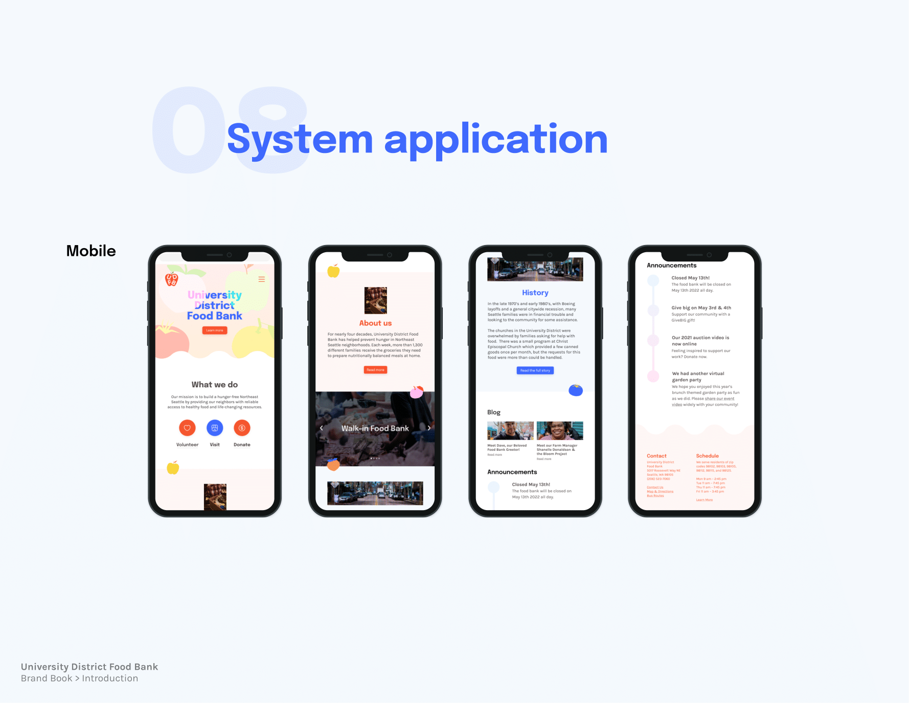
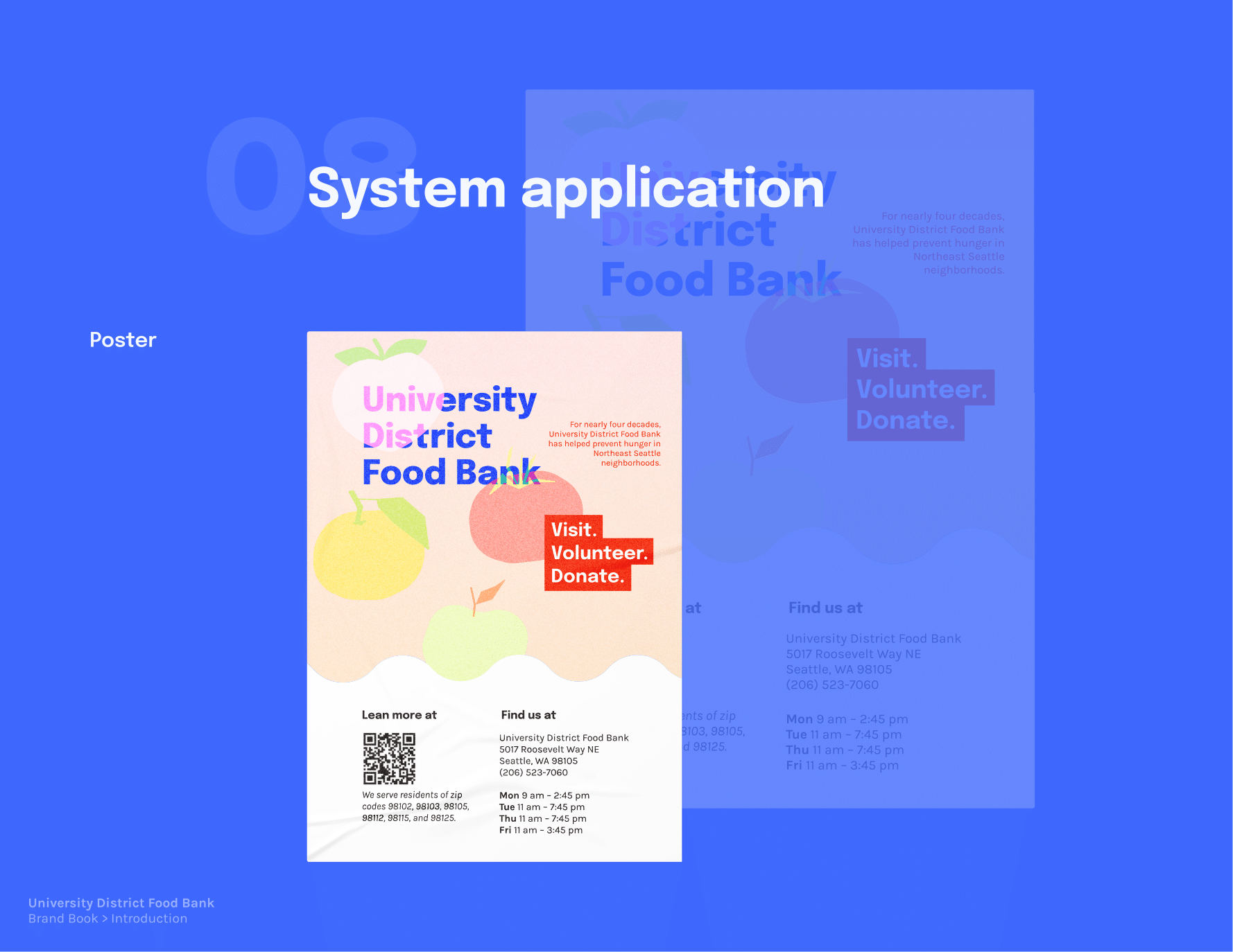
▶ Prototype the landing page and any alternate promotional materials in Figma
▶ Deliver a final brand book that delineates and summarizes my research and design processes altogether
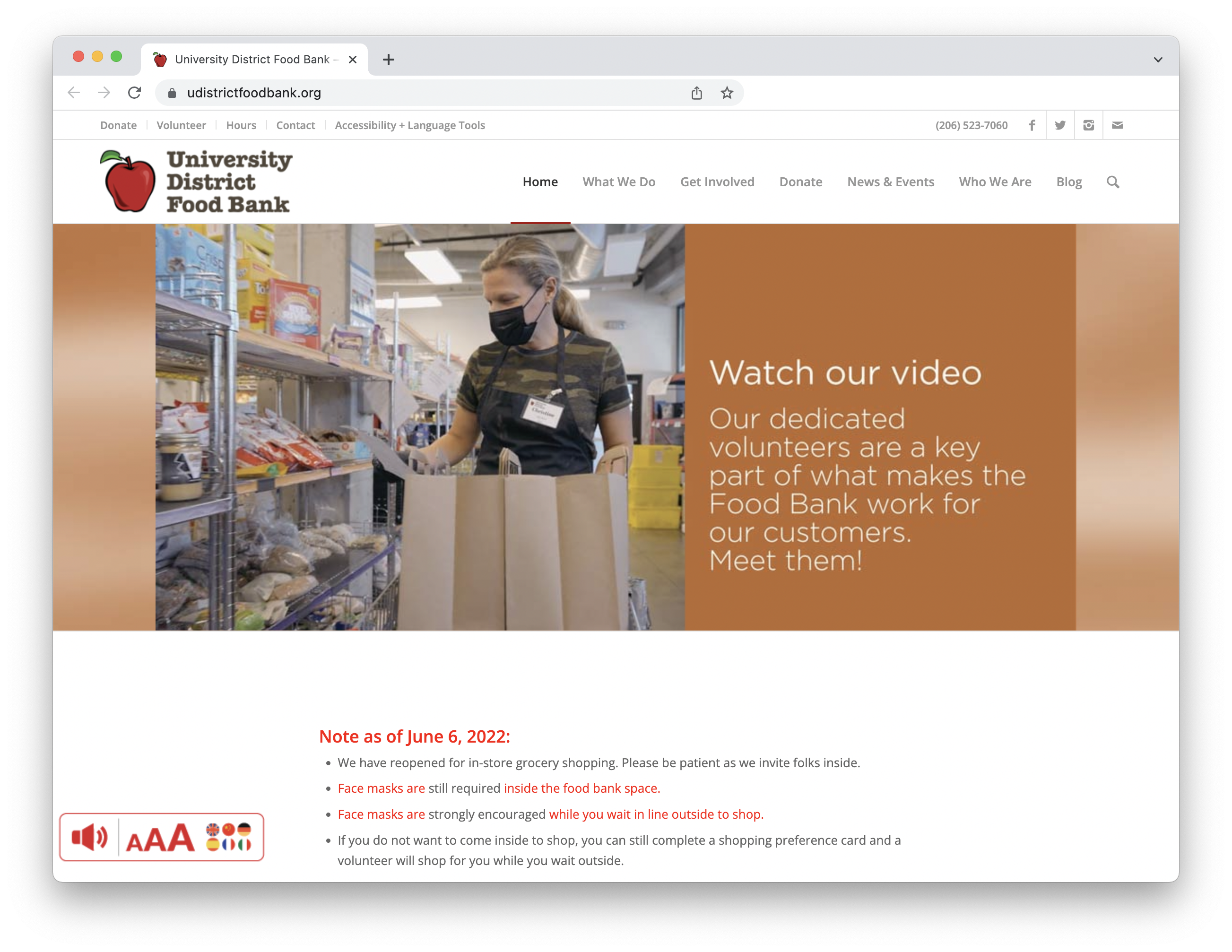
1. The original design
2. My research direction
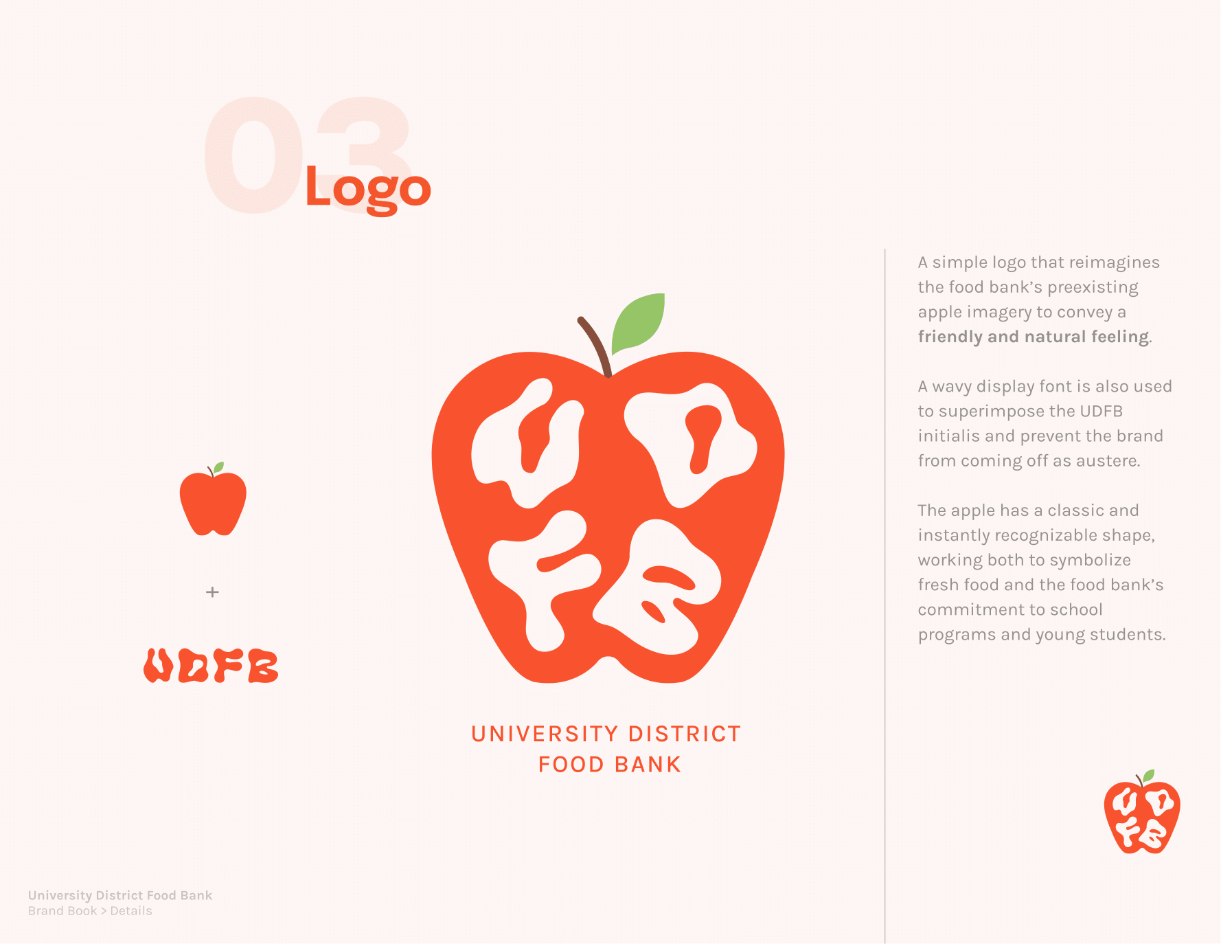
The current UDFB website is generally clean and visually consistent, as it mostly applies a
font palette of black/grey/red with grey dividers on a white background, and the red apple logo helps tie into its visual system and promote cohesion.
The image carousel at the top of the page that directs the user to its main services is also helpful. However, I think that if I were to frequent this page as a customer I would prefer not having to constantly scroll past its large "mission statement" and "about" text blocks to get to the rest of the page.
Also considering that the UDFB page is not about creating a sustained digital experience (e.g. the website itself is not the product) and is more about
guiding people with some sort of physical need or interest, actions on the website are therefore assumed to translate to a physical action (finding information
about food bank hours, filling out a sign-up survey in order to volunteer, submitting an
application for home deliveries, etc.). With this in mind, its design should maximize efficiency of
navigation and immediacy of information. There is no point in keeping someone on the website
longer than they want to be knowing the website itself isn’t a social environment, but rather a
vehicle to connect its users to the appropriate form, resource, guide, et cetera. As it stands right now, the
website certainly offers a lot of information, though while researching I found that one area of improvement would be getting to pertinent facts with more ease.
In the end, my directives included:
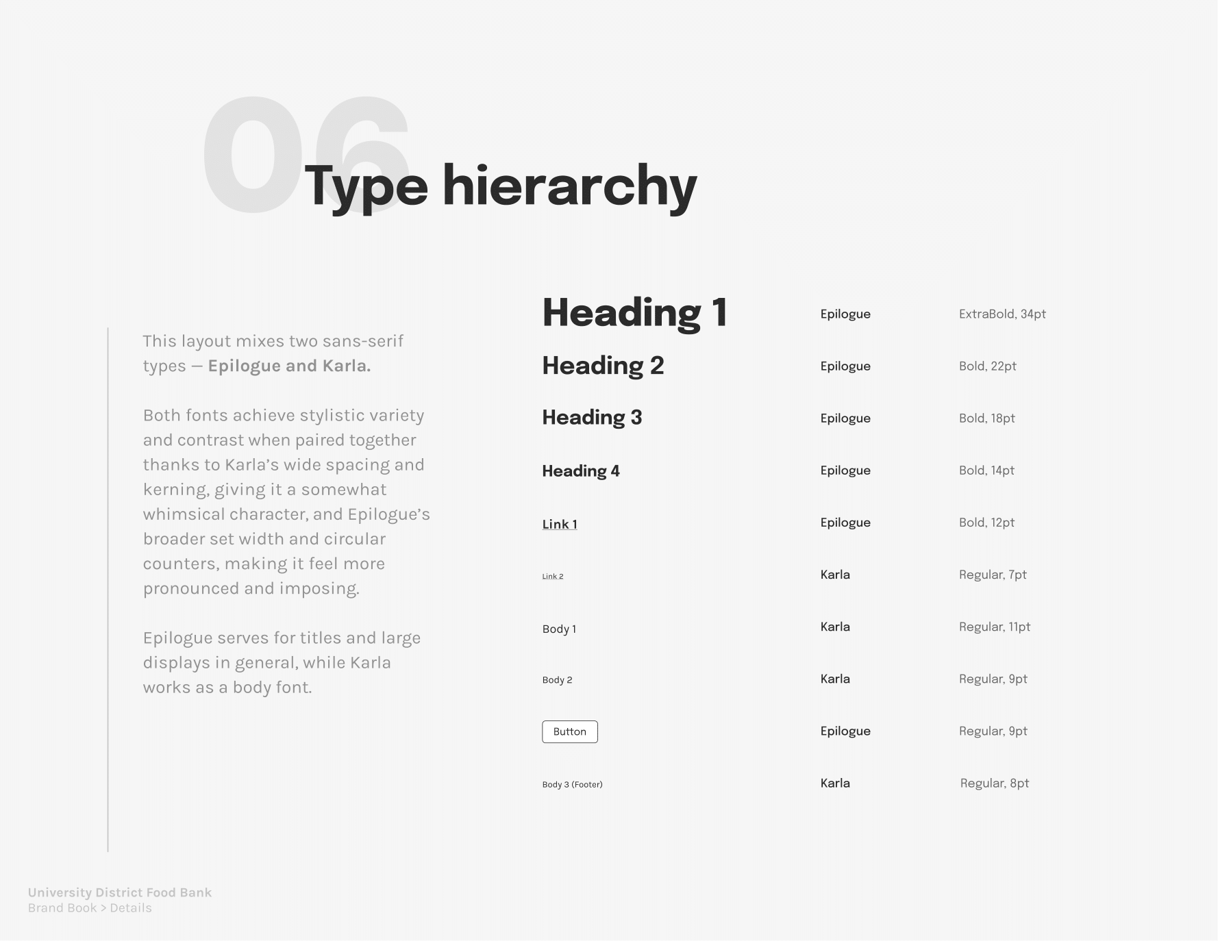
- Increase font size and restructure paragraph composition for general readability
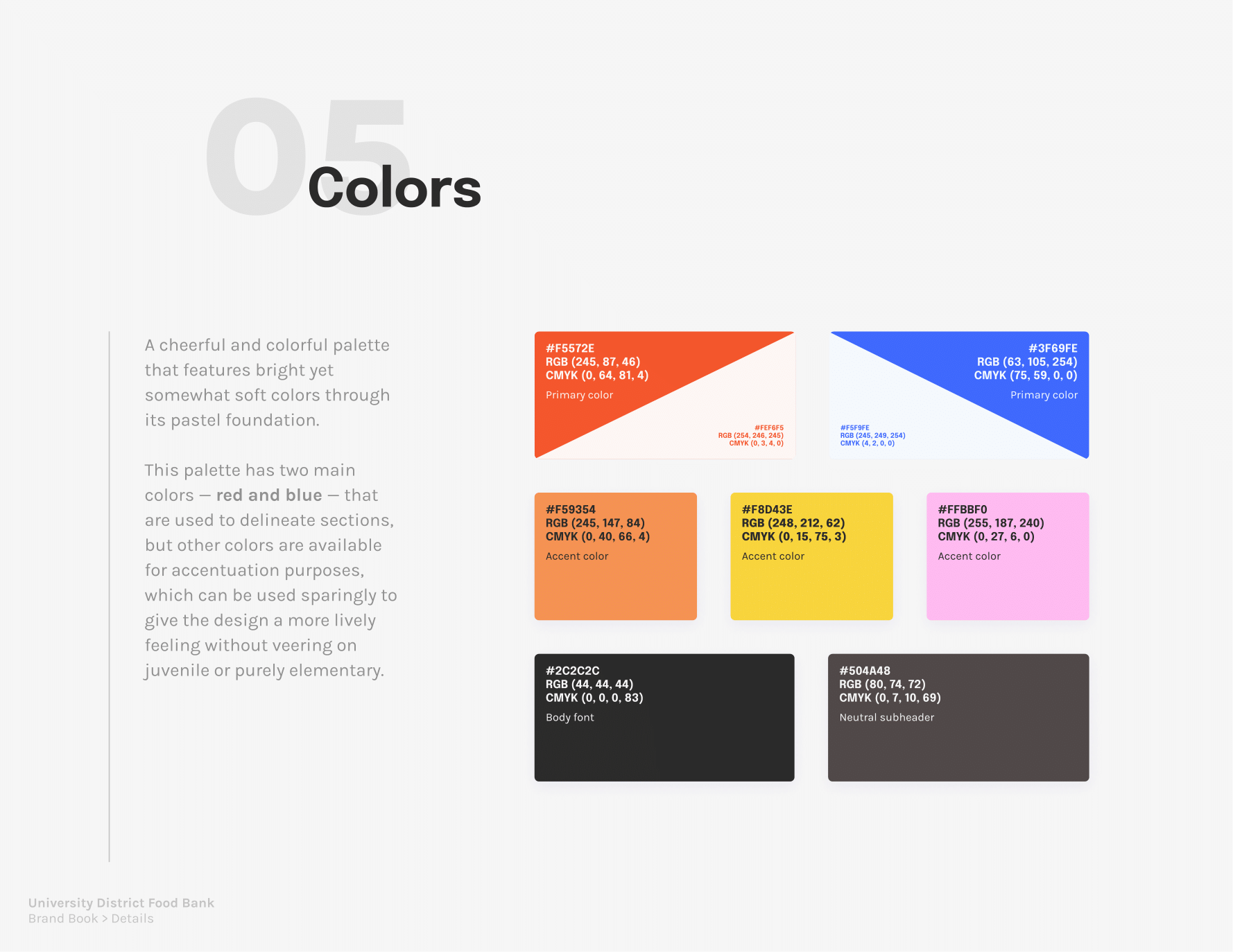
- Introduce a stronger, more cohesive color palette; do not mix important links with other accent colors and clearly delineate clickable links
- Strengthen hirearchy of information by introducing proper headers and spacing, collapsing verbose information and/or dividing sections when appropriate
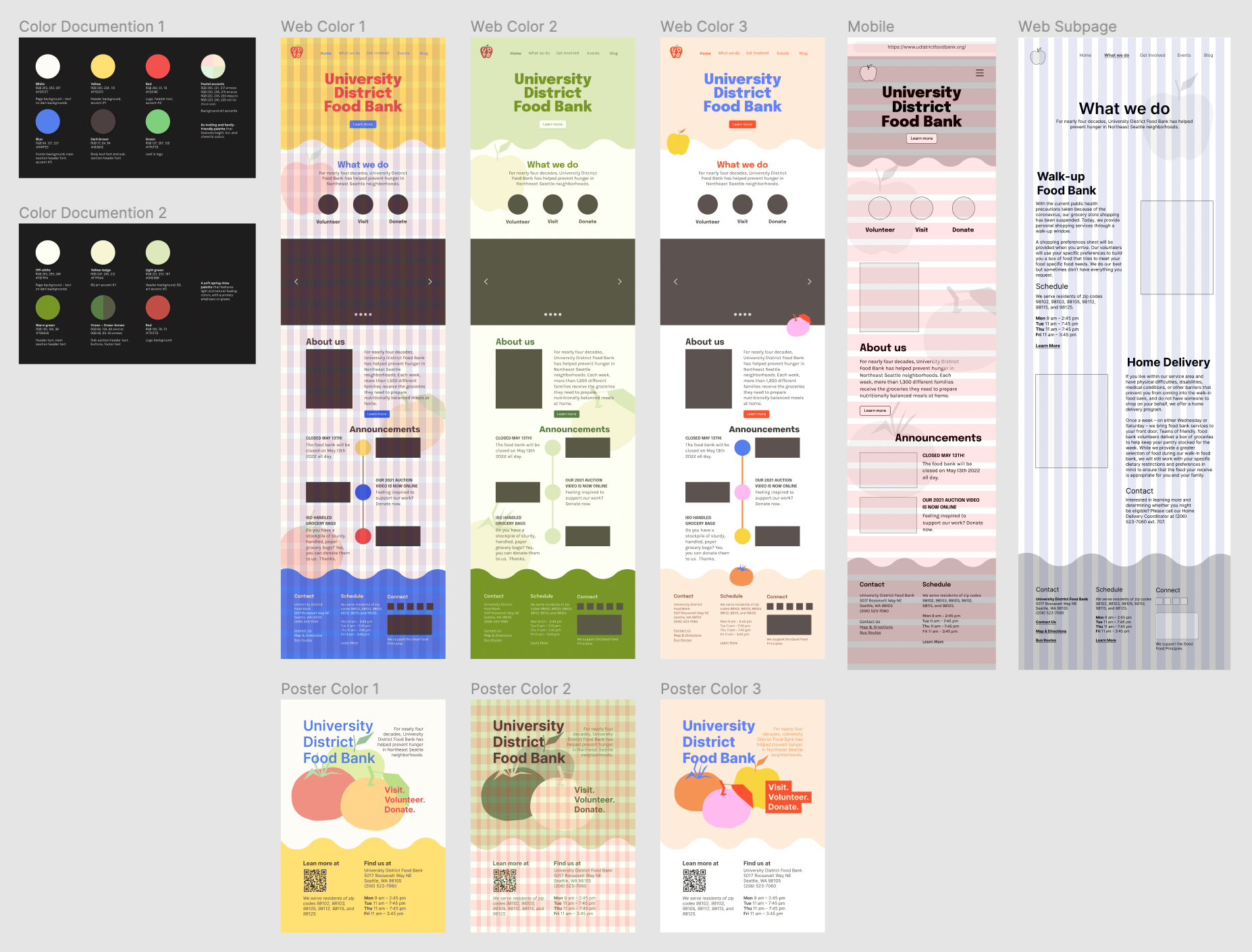
Some early color prototypes
3. Final brand book